top of page
Connecting community through food and friendship.
C Care is a community-focused organisation supporting connection through food, care and shared experience. The brief was to refresh the brand identity to feel more confident and contemporary, while retaining warmth, trust and approachability at its core.
Scope
Brand identity
Campaign design
EDM newsletter design
Digital and social assets


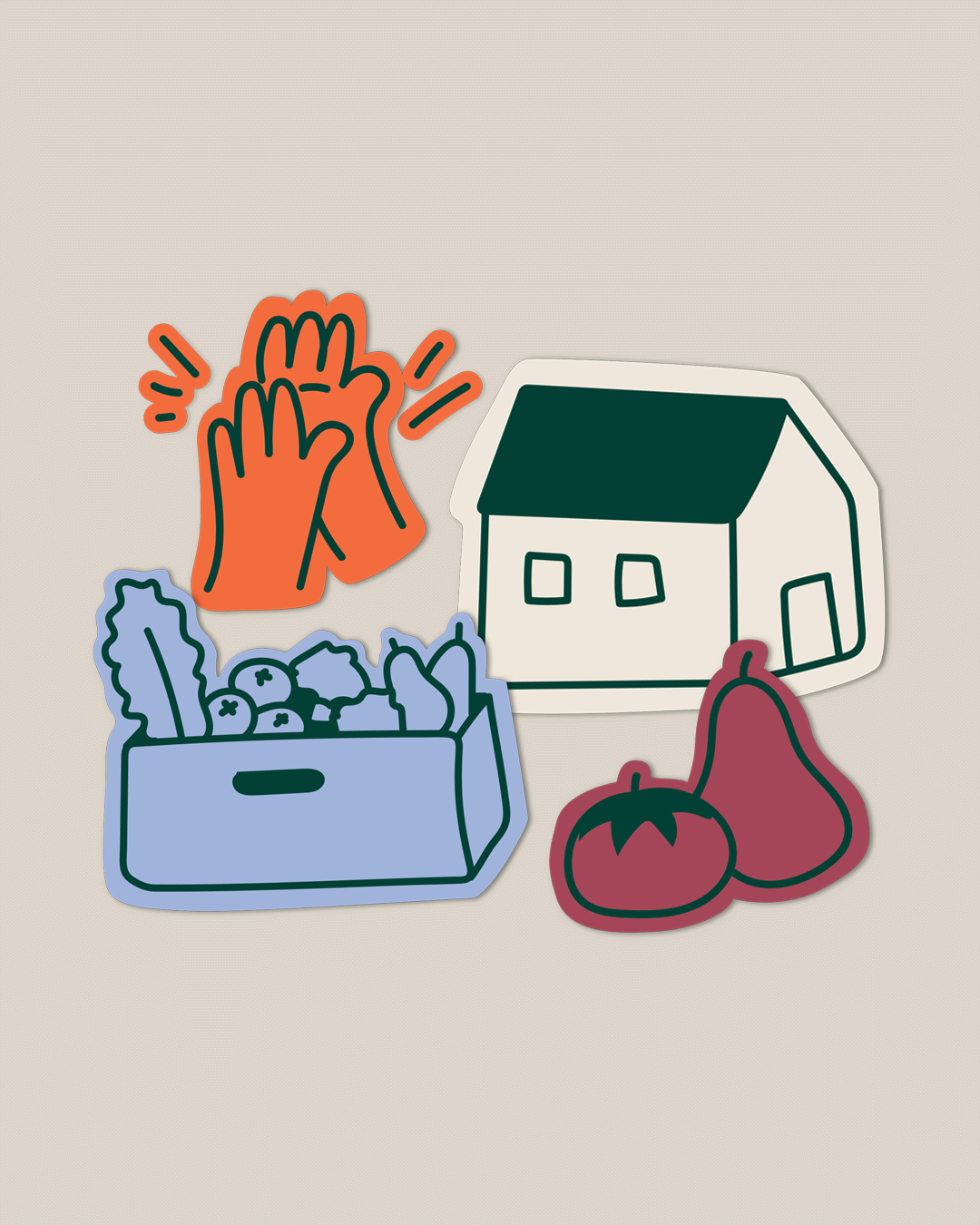
The process centred on balancing clarity with humanity - using clean, confident typography to reflect professionalism, alongside a softer visual gesture that brings warmth to the identity. The curved connection within the logo introduces a subtle, human detail, evoking kindness, positivity and connection. The result is a flexible identity that feels welcoming, recognisable and aligned with C Care’s mission and values.


bottom of page