top of page
A contemporary twist on your favourite classic.
G& is a contemporary brand with a bold, modern personality. The brief was to develop a visual identity that balances strength and approachability - a system capable of holding its own across digital, print and environmental touchpoints while feeling warm, human and distinct.
Featured
Young Designers of Australia Magazine
Scope
Naming
Brand identity
Custom typographic treatment
Packaging design


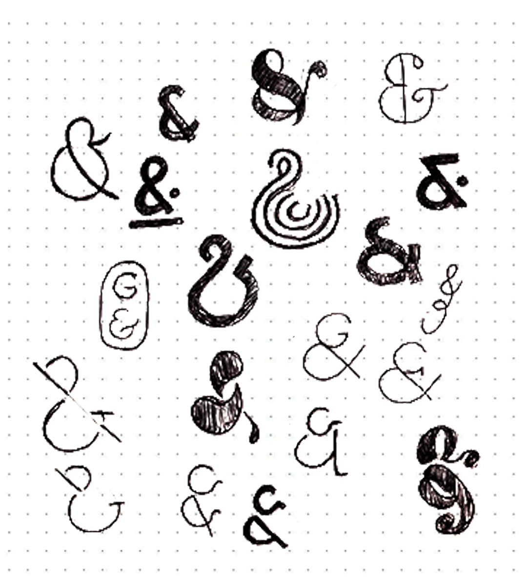
Through a process of typographic refinement and thoughtful detail, the identity uses clean, confident letterforms paired with a bespoke connection between characters to introduce a sense of movement and character. The result is a visual system that feels purposeful and recognisable, reflecting G&’s commitment to clarity, quality and connection.


bottom of page