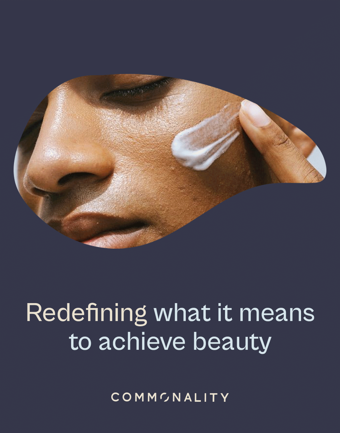
Redefining what it means to achieve beauty.
Commonality is a gender-neutral beauty brand challenging traditional norms within the industry. The brief was to create a visual identity and packaging system that reflects inclusivity, equality and the idea of shared humanity without relying on familiar beauty tropes.
Scope
Brand identity
Dielines and prototyping
Packaging design
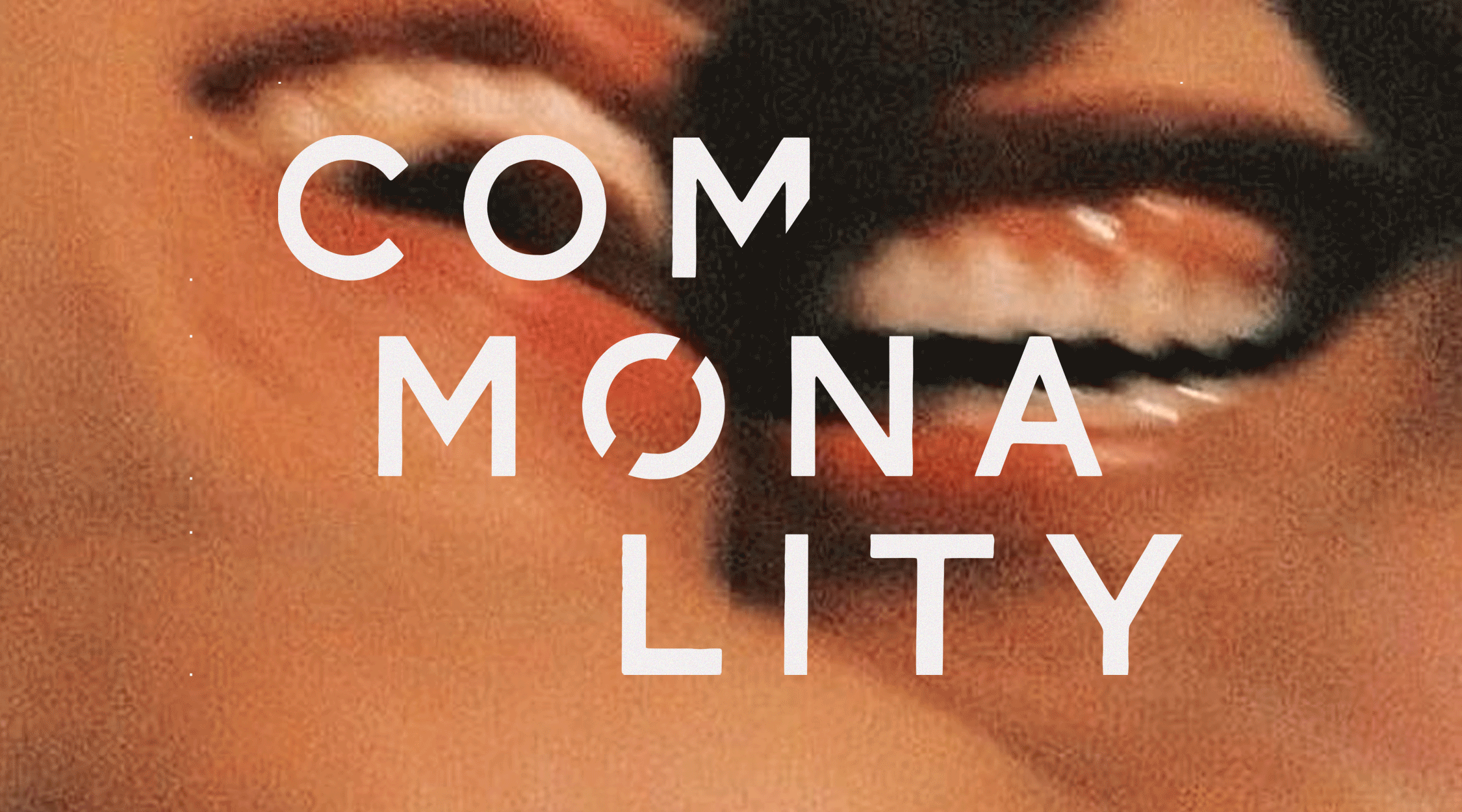
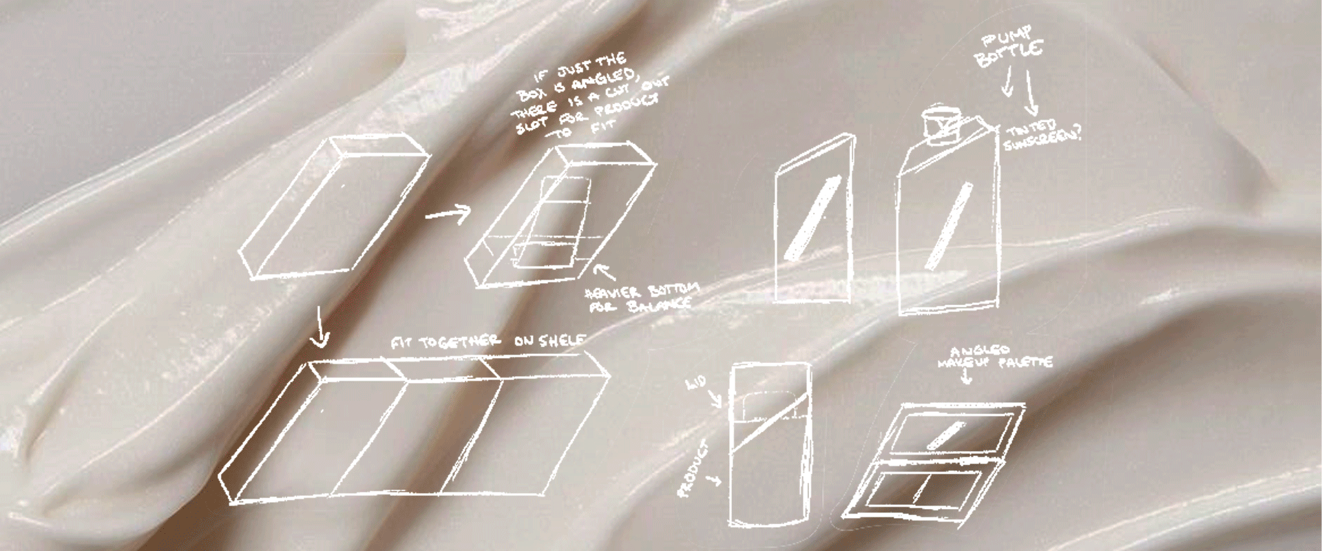
The identity centres around a bold, pared-back logo, with type arranged across three lines and intersected by a diagonal line to symbolise the disruption of conventional boundaries. The process involved extensive prototyping and exploration, resulting in a packaging system where structure and graphic language work together. Custom box dielines were developed with an outer lid and inner colour reveal, creating a continuous diagonal detail that carries through the packaging and reinforces the brand’s core message of breaking down barriers.